Let’s talk about UX. Here you can see some screens in a major Parisian train station. A few years ago, they replaced the gigantic, noisy split-flap panels that come to mind when we think of train stations.
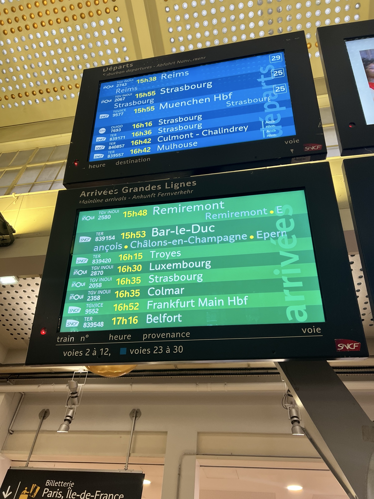
We could argue that the giant panels were better for visibility from a distance, but that is mitigated by the ability to place these screens in multiple locations throughout the station. The change happened several years ago, but the version you see here is new, with a subtle difference.
Do you notice it? I can see when a train is due to depart (in blue) or arrive (in green). I can see the train ID, its destination or origin, the platform… but wait. WHERE IS THE CURRENT TIME?
The old version included it. They left out one train to make room for it (and cycled through pages when there were too many trains) in order to display the time. They also had a “multiscreen” option that kept the time on the last screen only.
The split-flap panels displayed the time too, often with the biggest clock you’d see outside of a church. WHAT TIME IS IT? DO I HAVE TIME TO BUY A COOKIE?
As developers (and PMs), always take a step back and remember the purpose of your app. Change for the sake of change is counterproductive. When you come across something that seems ‘stupid’, consider whether it was designed that way for a reason you haven’t thought of.
Epilogue: I had time for a cookie.